what is the best color to paint kitchen cabinets
May 19, 2025
Leave a message
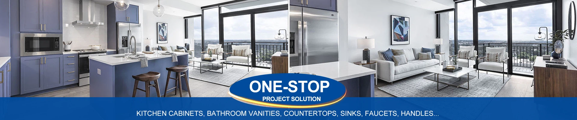
Best Colors to Paint Kitchen Cabinets (2024 Trends)
Choosing the right cabinet color depends on your style, kitchen size, and lighting, but these timeless and trendy shades are dominating kitchens in 2024:
1. Warm White (Timeless & Versatile)
Why: Brightens spaces, pairs with any decor, and hides smudges better than stark white.
Top Picks:
Benjamin Moore Simply White (OC-117): Crisp yet warm.
Sherwin-Williams Alabaster (SW 7008): Creamy neutral.
Best For: Small kitchens, farmhouse styles, or pairing with bold backsplashes.
2. Sage Green (Nature-Inspired)
Why: Calming and earthy, perfect for biophilic design. Works with brass, wood, and marble.
Top Picks:
Sherwin-Williams Evergreen Fog (SW 9130): 2022 Color of the Year.
Farrow & Ball Pigeon (No. 25): Gray-green sophistication.
Best For: Rustic, coastal, or transitional kitchens.
3. Soft Black (Dramatic & Modern)
Why: Adds contrast and sophistication. Matte finishes hide fingerprints.
Top Picks:
Farrow & Ball Railings (No. 31): Deep, velvety black.
Sherwin-Williams Tricorn Black (SW 6258): True black with no undertones.
Best For: Open-concept kitchens, islands, or modern/industrial styles.
4. Warm Greige (Neutral Flexibility)
Why: A blend of gray and beige that adapts to warm or cool accents.
Top Picks:
Benjamin Moore Revere Pewter (HC-172): Timeless greige.
Sherwin-Williams Agreeable Gray (SW 7029): Light and airy.
Best For: Transitional kitchens, resale value, or pairing with wood tones.
5. Navy Blue (Classic & Bold)
Why: Rich and moody, yet timeless. Pair with brass or gold hardware for luxe contrast.
Top Picks:
Benjamin Moore Hale Navy (HC-154): Iconic navy.
Farrow & Ball Hague Blue (No. 30): Deep teal-navy hybrid.
Best For: Traditional, coastal, or eclectic kitchens.
6. Terracotta (Earthy & Warm)
Why: Brings Mediterranean warmth and pairs beautifully with natural textures.
Top Picks:
Sherwin-Williams Cavern Clay (SW 7701): Southwest-inspired.
Behr Adobe Clay (PPU5-16): Muted burnt orange.
Best For: Boho, Spanish, or desert-modern kitchens.
7. Two-Tone Combos (Dynamic Contrast)
Why: Adds depth and visual interest. Popular pairings:
White uppers + navy lowers.
Sage uppers + wood-tone lowers.
Black lowers + open shelving.
Best For: Breaking up monotony in large kitchens or highlighting islands.
How to Choose
Lighting:
North-facing rooms → Warm whites or soft greens.
South-facing rooms → Cool grays or bold colors.
Cabinet Style:
Shaker cabinets → Classic whites or muted tones.
Flat-panel cabinets → Bold colors (black, navy).
Hardware & Countertops:
Brass/gold → Warm whites, greens, or blues.
Stainless steel/black → Modern blacks or grays.
Avoid These Mistakes
Skipping sample testing (paint looks different in your lighting).
Ignoring existing flooring/backsplash (ensure harmony).
Overlooking maintenance (glossy finishes show flaws; matte hides them).
Final Recommendation:
For timeless appeal, go with Benjamin Moore Simply White or Sherwin-Williams Alabaster. For bold personality, try Farrow & Ball Hague Blue or Sherwin-Williams Tricorn Black. Always test samples at different times of day! 🎨✨