Color Trends For Kitchen Cabinets 2026
Apr 07, 2026
Leave a message
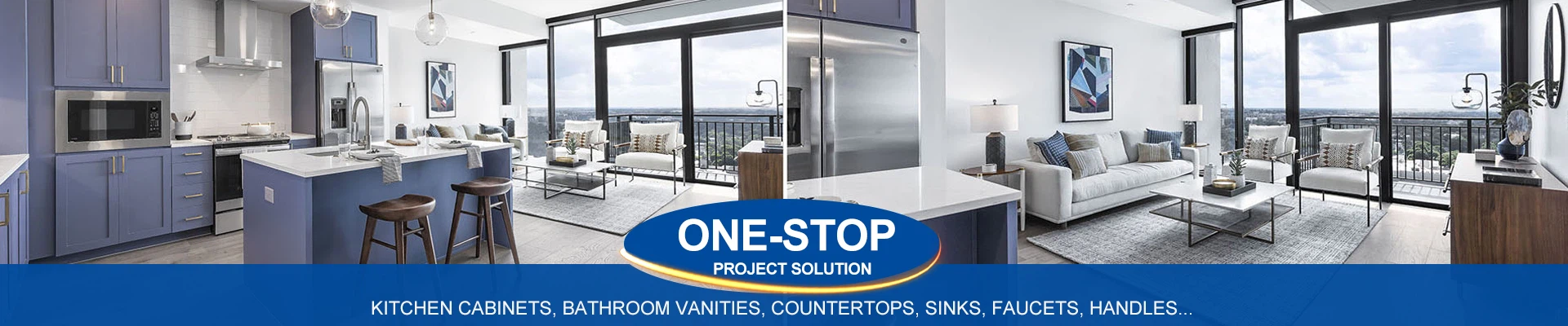
If you are specifying kitchen cabinets for volume housing, multi-family developments, or trade supply, you will have noticed a shift. Grey is retreating. White is no longer a safe default. Buyers are asking for something else – something warmer, more natural, and surprisingly specific.
We have analysed order data from the last twelve months, spoken to three contract specifiers, and tracked what is showing up in architectural plans for 2026. Here is what commercial buyers actually want.
Warm Earth Tones Are Replacing Cool Greys
For the best part of a decade, grey was the answer to everything. Greige, mid-grey, charcoal – it was everywhere. In 2026, grey is not gone, but it is no longer dominant. Buyers are shifting toward warm earth tones:
Taupe – warmer than greige, works with oak and walnut flooring
Clay – a soft, dusty terracotta without being pink
Stone – lighter than taupe, closer to natural limestone
These colours appeal to developers because they hide wear better than white, feel less cold than grey, and work across both modern and traditional cabinet profiles.
One specifier we work with in Texas switched from grey to clay for a 200-unit apartment complex. He said residents described the kitchens as "cosy" instead of "clean". That matters for rental retention.
Sage Green Is No Longer a Niche Choice
Sage green has been around for a few years, mostly in higher-end residential. In 2026, it is moving into volume B2B. We are seeing it specified for:
Assisted living kitchens
Boutique hotel suites
Build-to-rent developments in suburban areas
The reason is simple. Sage green feels premium without costing premium. It photographs well. It pairs with butcher block, quartz, and even laminate worktops. And it does not show every splash or fingerprint – a genuine advantage for landlords.
If you are a trade buyer, stock sage green in shaker and flat panel profiles. That is what your customers will ask for.
Duck Egg Blue – The Dark Horse for 2026
This one surprised us. Duck egg blue has always been a cottage kitchen colour – lovely but niche. In the last six months, we have seen it specified for coastal developments, holiday let furnishing projects, and even a small chain of bakeries.
Duck egg blue works because it is soft enough to be neutral but has enough colour to feel intentional. It pairs with brass, nickel, and black hardware. It looks fresh in morning light and warm under evening LEDs.
For B2B buyers: offer duck egg blue as a premium option, not a standard line. It sells best in kitchens with natural light and white or light oak worktops.
Buttermilk and Cream – The New White
White cabinets are not dead, but the white has changed. Stark, brilliant white is out. Buttermilk, cream, and warm off-white are in.
These warmer whites solve two problems that pure white creates. First, they do not look clinical. Second, they do not show every single mark. In a rental property or a busy family home, that is a real advantage.
We are seeing buttermilk specified most often for:
Small apartment kitchens (makes them feel larger without being harsh)
Holiday cabins and Airbnbs (photographs as "fresh" not "sterile")
Scandi-style developments (pairs with light plywood and oak)
If you currently stock a pure white cabinet, consider adding a buttermilk option alongside it. Your trade customers will thank you.
What About Navy and Dark Green?
Dark colours have not disappeared, but they have moved. In 2024 and 2025, navy and forest green were popular for islands and lower cabinets. In 2026, demand has softened.
Buyers are not rejecting dark colours entirely. They are being more selective. Navy now sells best in coastal towns. Forest green is holding up in rural developments and eco-housing projects. For standard urban apartments, dark cabinets are losing ground to taupe and clay.
Our advice: keep one dark option in your range, but do not stock deep inventory. Make it bespoke or made-to-order.
Two-Colour Kitchens Are Now Standard
Grey uppers and navy lowers was the look for a while. In 2026, two-colour kitchens are still common, but the combinations have changed.
Buttermilk uppers + clay lowers – warm, soft, residential
Stone uppers + sage lowers – calm, natural, slightly modern
Taupe uppers + duck egg blue lowers – unusual but memorable
The rule is simple: lighter colour on top, stronger colour below. This works for wall and base cabinets. It also works for tall cabinets if you split them horizontally.
If you supply to developers, offer two-colour as a standard option, not a special request. Make it easy to specify.