

Best Color Kitchen Cabinets in Canada
May 14, 2025
Leave a message
Here's a guide to the best kitchen cabinet colors in Canada, balancing timeless appeal, regional trends, and practicality for the country's diverse climates and design preferences:
1. Classic White
Why: Brightens spaces during long winters, pairs with any style (modern to farmhouse).
Top Picks:
Benjamin Moore Chantilly Lace (pure, crisp white).
Sherwin-Williams Alabaster (warm, creamy white).
Best For: Small kitchens, urban condos, and coastal homes (e.g., Vancouver, Halifax).
2. Warm Gray
Why: Neutral yet cozy, complements Canada's love for natural materials like stone and wood.
Top Picks:
Benjamin Moore Revere Pewter (greige).
Farrow & Ball Pigeon (muted green-gray).
Best For: Open-concept spaces in provinces like Ontario or Alberta.
3. Sage Green
Why: Reflects Canada's natural landscapes; calming and on-trend for 2024.
Top Picks:
Benjamin Moore October Mist (soft green).
Sherwin-Williams Evergreen Fog (earthy sage).
Best For: Rustic cabins, eco-friendly designs, and homes in forested regions (BC, Quebec).
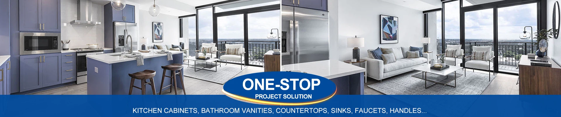
4. Navy Blue
Why: Bold yet timeless, adds depth to modern and traditional kitchens.
Top Picks:
Benjamin Moore Hale Navy (rich, versatile).
Farrow & Ball Hague Blue (dramatic).
Best For: Statement islands or paired with brass hardware (popular in Toronto and Montreal).
5. Warm Wood Tones
Why: Celebrates Canada's lumber heritage; ideal for organic, Scandinavian, or farmhouse styles.
Top Picks:
Natural maple, walnut, or white oak.
Stained finishes (e.g., Provincial by Varathane for a honeyed look).
Best For: Cottage kitchens, Prairie-style homes, and warmth-seeking spaces in colder regions.
6. Charcoal/Black
Why: Sleek and modern, contrasts beautifully with light countertops.
Top Picks:
Sherwin-Williams Tricorn Black (true black).
Benjamin Moore Wrought Iron (softened black).
Best For: Urban lofts, high-contrast designs, and minimalist kitchens.
7. Two-Tone Combinations
Why: Adds visual interest; practical for defining zones.
Popular Pairings:
White uppers + navy lowers.
Sage green lowers + warm wood uppers.
Best For: Open kitchens in suburbs or family-friendly layouts.
Regional & Climate Considerations
Coastal BC/Atlantic Canada: Light, airy colors (white, sage) to balance humidity and gray skies.
Prairies (AB/SK): Warm neutrals (greige, wood tones) to offset cold winters.
Quebec/Ontario: Bold hues (navy, forest green) for European-inspired elegance.
Canadian Paint Brands to Trust
Benjamin Moore (Aura/Cabinet Coat lines).
Para Paints (durable, low-VOC).
Cloverdale Paint (popular in Western Canada).
Tips for Choosing
Lighting: Test swatches in natural and artificial light (critical for Canada's dark winters).
Countertops: Pair with Canadian favorites like quartz (Caesarstone), granite, or butcher block.
Hardware: Matte black, brass, or nickel for contrast.
Final Note: Opt for semi-gloss or satin finishes for durability against Canada's seasonal messes (mud, snow, cooking splatters). Whether you're in a Calgary ranch or a Toronto high-rise, these colors ensure your kitchen feels inviting and stylish year-round! 🍁✨